As you begin the art of mixing textures and patterns in your home decor, you're crafting a visual narrative that's uniquely yours. By combining rough and smooth textures, bold and subtle patterns, and matte and shiny finishes, you'll create a space that's rich in depth and personality. Balance is key, so be mindful of the 60-30-10 rule and the interplay of finishes. As you experiment with layering patterns and textures, you'll discover a world of possibilities – and with every deliberate choice, you'll inch closer to a space that truly reflects your individual style, with endless opportunities to explore and express yourself waiting just ahead.
Understanding Texture and Pattern Basics
Perfecting the art of mixing textures and patterns in home decor starts with a solid grasp of the fundamentals. You need to understand the basics of texture and pattern to create a harmonious and visually appealing space. Texture refers to the physical quality of a surface or material, and there are several types to take into account, including smooth, rough, soft, and coarse. For instance, velvet is a soft, luxurious texture, whereas reclaimed wood is rough and rustic.
Patterns, in contrast, are the visual designs or motifs used in home decor. There are several pattern categories, including stripes, florals, geometrics, and abstracts. Each pattern has its own unique impact on a room, and you can use them to create a mood, add visual interest, or create a sense of continuity. For example, a bold geometric pattern can add energy to a room, whereas a subtle floral pattern can create a calming atmosphere.
Understanding the significance of texture and pattern is vital in home decor. Texture can add depth and tactility to a space, whereas pattern can create visual interest and personality. By incorporating different texture examples, such as throw blankets, rugs, and upholstery, and staying abreast of pattern trends, like statement walls and bold color blocking, you can create a space that's both beautiful and functional. By mastering the basics of texture and pattern, you'll be well positioned to creating a home that's truly one-of-a-kind.
Balancing Contrasting Elements
Now that you have a solid grasp of texture and pattern basics, it's time to put your knowledge into practice. Balancing contrasting elements is where the magic happens, and it's fundamental to create a visually appealing space that resonates with you emotionally. Texture psychology plays a significant role in this process, as different textures can evoke distinct emotions and moods. For instance, smooth surfaces can create a sense of calmness, whereas rough textures can add energy to a room.
When combining patterns, consider the rhythm they create. A mix of bold and subtle patterns can add visual interest, but it's critical to maintain a sense of harmony. Color harmony is crucial in balancing contrasting elements, as clashing colors can disrupt the visual flow. To avoid this, choose a dominant color and use its variations to create a cohesive look.
Spatial dynamics similarly come into play when balancing contrasting elements. Consider the scale and proportion of furniture, decor, and patterns to create a sense of balance and harmony. Thematic consistency is key to tying everything together, so choose a theme or style and stick to it. By balancing contrasting elements, you'll create a sensory experience that's both engaging and emotionally impactful. Remember, the goal is to create a space that not only looks amazing but also makes you feel something.
Mixing Matte and Shiny Finishes
When you combine matte and shiny finishes in your home decor, you're creating a balance of opposites that adds depth to your space. This distinction creates visual interest, drawing your eye to specific areas and making your room feel more dynamic. By embracing harmony in distinction, you'll find that these opposing finishes work together to create a look that's both sophisticated and enchanting.
Balance of Opposites
A few well-placed opposites can create a visually appealing balance in your home decor, and mixing matte and shiny finishes is a great way to achieve this. When you combine these contrasting finishes, you create a dynamic visual experience that adds depth and interest to your space.
| Matte Finish | Shiny Finish |
|---|---|
| Softens light | Reflects light |
| Absorbs sound | Amplifies sound |
| Creates a calm atmosphere | Creates a lively atmosphere |
| Hides fingerprints | Shows fingerprints |
Visual Interest Created
By combining matte and shiny finishes, you inject visual interest into your space, creating a dynamic interplay that captivates the eye and adds depth to your decor. This harmonious blend of opposing textures sparks visual intrigue, as the eye is drawn to the contrasting reflections and absorptions of light. The resulting texture interplay creates a sense of pattern dynamics, where the matte and shiny finishes engage in a rhythmic dance, establishing an aesthetic rhythm that resonates throughout the space.
As you balance matte and shiny elements, you achieve design cohesion, where each component improves the other, generating a sensory experience that's both tactile and visual. This fusion of textures likewise influences spatial perception, as the interplay of light and shadow creates an immersive atmosphere that draws you in. Moreover, the color interaction between matte and shiny finishes intensifies the emotional impact of your design, allowing you to express your artistic vision with nuance and sophistication. By embracing this contrasting texture combination, you reveal a world of creative possibilities, where visual interest and emotional resonance converge.
Harmony in Contrast
Through the deliberate juxtaposition of matte and shiny finishes, you craft an intriguing visual narrative that invites the eye to explore and discover. This distinction creates a dynamic interplay of light and shadow, adding depth and visual interest to a room. By combining matte and shiny finishes, you can tap into color psychology, evoking emotions and moods that resonate with your personal expression. For instance, pairing matte wood tones with shiny metallic accents can evoke a sense of sophistication and luxury.
When it comes to texture trends, mixing matte and shiny finishes allows you to balance contrasting sensations, creating a harmonious blend of rough and smooth. This distinction is rooted in design principles, which emphasize the importance of variety and surprise. Cultural influences, such as Japanese wabi-sabi, likewise celebrate the beauty of imperfection and contrast. As you experiment with seasonal styles, keep in mind that harmony in contrast is key to creating a unique and enchanting space that reflects your personality. By embracing this design principle, you'll create a space that's both visually stunning and emotionally resonant.
Combining Rough and Smooth Textures
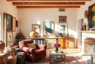
You're drawn to the tactile experience of rough textures, but you similarly crave the elegance of smooth ones. This contrast is exactly what makes combining rough and smooth textures so intriguing in home decor. By incorporating rough fabrics, like woven jute or chunky knit throws, alongside smooth surfaces, such as polished wood or sleek metal, you create a sensory experience that's both engaging and harmonious.
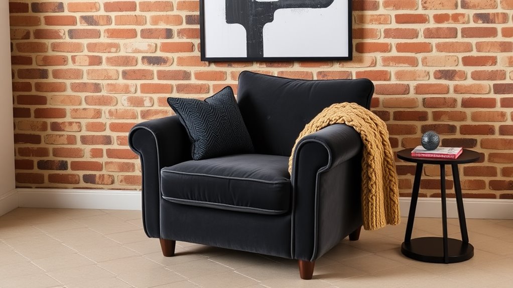
The key to balancing these tactile contrasts lies in visual balance. You can achieve this by layering rough textures with smooth ones, creating a sense of depth and dimensionality. For instance, pair a plush area rug with a sleek coffee table or hang a rough-hewn wooden mirror above a smooth velvet sofa. By doing so, you'll create a space that's both visually appealing and tactilely stimulating.
When selecting materials, consider finish combinations that complement each other. A matte finish on a rough-textured fabric can be beautifully offset by a glossy finish on a smooth surface. This contrast will add depth and interest to your design. By incorporating a variety of textures and finishes, you'll create a space that's not only visually striking but additionally cohesive in its design. Remember, the key to successfully combining rough and smooth textures is to create a balance that's both harmonious and thought-provoking, ultimately enhancing your sensory experience.
Creating Harmony With Pattern Scales
When mixing patterns in your home decor, you'll want to balance large and small scales to create visual harmony. You can likewise mix bold patterns with subtle ones to add depth and interest to a room. By unifying contrasting elements, you'll create a cohesive look that ties the whole space together.
Balancing Large and Small
Choosing patterns for your home decor can be an intimidating task, especially regarding balancing large and small scales. You want to create a visually appealing space that's not overwhelming or underwhelming. The key is to achieve a proportionate balance between large and small patterns.
| Pattern Scale | Visual Hierarchy | Effect |
|---|---|---|
| Large Scale | Dominant | Creates focal points |
| Small Scale | Subtle | Adds texture interplay |
| Mix of Large and Small | Balanced | Establishes pattern rhythm |
| Contrasting Scales | Visual Interest | Creates scale variation |
| Harmonious Scales | Cohesive Design | Improves spatial awareness |
To achieve harmony, consider the 60-30-10 rule: 60% of the room features a dominant pattern, 30% a secondary pattern, and 10% an accent pattern. This balance creates a visual hierarchy, guiding the eye through the space. Remember, it's all about creating a sense of rhythm and flow. By balancing large and small patterns, you'll create a visually stunning space that exudes design cohesion.
Mixing Bold and Subtle
By incorporating a mix of bold and subtle patterns, you can add depth and visual interest to your space. Bold accents draw the eye and create a sense of drama, whereas subtle undertones provide a calming balance. The key to successfully mixing bold and subtle patterns is to strike a harmonious balance between the two. Start by introducing a bold pattern, such as a geometric-print rug or a lively piece of artwork, and then balance it with subtle undertones, like a solid-colored sofa or a delicate textile. You can additionally use bold accents to add a pop of personality to a room, whereas subtle undertones provide a sophisticated backdrop. Remember, the bold pieces should be statement-makers, whereas the subtle elements should provide a sense of calm. By combining these two extremes, you'll create a visually stunning space that's both dynamic and soothing.
Unifying Contrasting Elements
As you experiment with different patterns, remember to adapt to seasonal changes. Update your decor with lighter, brighter patterns in summer and richer, deeper ones in winter. Your personal expression should shine through in your design choices, evoking emotional resonance and cultural influences. By thoughtfully unifying contrasting elements, you'll create a space that evolves with your design sensibilities, staying fresh and exciting over time.
Adding Depth With Layered Elements
How do you create a space that's both visually interesting and layered with depth? You do it by incorporating layered elements that tantalize the senses and create a rich, dimensional atmosphere. Start by combining layered textiles, such as plush throw blankets, chunky rugs, and velvety pillows, to create a tactile experience that invites touch. This mix of textures will improve your depth perception, making the space feel more expansive.
Next, experiment with color interplay by pairing bold, contrasting hues with similar textures. This will create a visually appealing contrast that adds depth to the space. Don't be afraid to mix materials, too – combining wood, metal, and glass, for instance, will add a level of sophistication and visual interest.
To take your space to the next level, focus on dimensional layering. This means incorporating elements with varying heights, lengths, and widths to create a visually cohesive look. By balancing these elements, you'll create a sense of harmony and balance in the space. Finally, don't overlook the importance of aesthetic layering – carefully curating your decorative pieces to create a sense of functional aesthetics will raise your space from mere decoration to true artistry. By incorporating these elements, you'll create a space that's not merely visually stunning but additionally rich with depth and character.
Breaking the Rules With Confidence
Breaking conventions doesn't mean throwing caution to the wind. It means being intentional with your design choices and having a clear vision for your space. With playful experimentation, you'll discover unexpected textures and patterns that work harmoniously together. So, don't be afraid to break the rules and push the boundaries of traditional design. Your space should be a reflection of you, and that requires taking risks and making fearless choices.
Frequently Asked Questions
How Do I Avoid Overwhelming a Space With Too Many Textures and Patterns?
When combining textures and patterns, you'll want to strike a delicate balance to avoid overwhelming the space. Start by identifying a common thread, like a shared color palette or style era, to create harmony. Then, limit yourself to 2-3 statement pieces, and balance them with neutral backgrounds. Remember, texture balance is key – mix rough with smooth, and pattern harmony is essential – blend bold with subtle. By doing so, you'll create a visually appealing space that's anything but overwhelming.
Can I Mix Metallic and Natural Materials in the Same Room?
You've probably stumbled upon a stunning combo of metallic and natural elements in a stylish space, and wondered, can I pull this off at home? The answer is yes! By balancing metallic accents with natural harmony, you'll create a visually appealing contrast. Think sleek metal lighting paired with a reclaimed wood coffee table or a velvet sofa with brass legs. The key is to mix in a way that feels intentional, not chaotic. So go ahead, experiment and find your perfect blend!
What Is the Ideal Ratio of Pattern to Solid Color in a Room?
In the context of creating a visually appealing space, you're probably wondering about the ideal ratio of pattern to solid color. The key is to strike a balance that achieves pattern harmony and color balance. Aim for a 60/40 or 70/30 split, where patterns cover about two-thirds of the room and solid colors make up the rest. This will create a dynamic, yet cohesive look that's anything but boring. By finding this sweet spot, you'll add depth and visual interest to your space.
Can I Use Texture and Pattern to Distract From a Room's Architectural Flaws?
Envision a masterful illusionist, expertly diverting attention from a room's imperfections. You can do the same by cleverly using texture and pattern to distract from architectural flaws. By achieving textural balance, you'll create a sense of visual harmony, drawing the eye away from trouble spots. Meanwhile, pattern harmony will weave a cohesive narrative, making those flaws all but disappear. So, don't let a room's shortcomings define its style – use texture and pattern to create a dazzling display of creative misdirection.
How Do I Incorporate Personal Items With Clashing Textures and Patterns?
You're enthusiastic to showcase your unique treasures, but worried they'll clash with your space's aesthetic. Don't hide them away! You can harmoniously incorporate personal items with contrasting styles by using them as personalized accents. For instance, place a vintage rug with a bold pattern in front of a sleek, modern sofa. This deliberate mix of contrasting styles will create a visually intriguing space that reflects your personality.